Curae
Project info:
Naming
Branding
Tools:
Illustrator
Photoshop

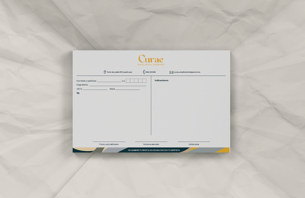
Curae, a dental clinic in Arequipa, Peru, aimed to break the stereotype that "going to the dentist is a nightmare." The challenge was to create a brand identity that avoided the typical clinical look of dental clinics, often associated with cold light blues and an intimidating atmosphere, while still preserving the essence of a professional dental practice.
The name "Curae," derived from the Spanish word curar (meaning "to heal"), reinforces this commitment to patient care and comfort.


Rationale
To shift perceptions, I developed a warm and inviting visual identity for Curae, using calming colors and friendly typography to communicate comfort, tranquility, and empathy.
This reimagining led to the positioning of Curae not as a "clinic," but as a "dental studio", a place focused on care and attention to oral health.


A warm and cozy dental studio
To create a dental studio that is both modern and inviting, I developed a design strategy that blended playful elements with a professional aesthetic.
Incorporating waves and organic shapes introduced movement and a sense of approachability, while a modern font and a tooth icon enhanced the brand recognition and trust.


